Demographic trends in London
[h4]London’s getting younger – especially to the East[/h4]
by Benjamin Hennig and Danny Dorling
Summary
![]() 1) London is getting younger,
1) London is getting younger,
![]() 2) the rate of increase is even higher amongst the very youngest (0-2 year olds),
2) the rate of increase is even higher amongst the very youngest (0-2 year olds),
![]() 3) Most of them are living out East and the rate of increase has been greatest in the East,
3) Most of them are living out East and the rate of increase has been greatest in the East,
![]() 4) Are public bodies able to provide adequate resources to meet the needs of this young population?
4) Are public bodies able to provide adequate resources to meet the needs of this young population?
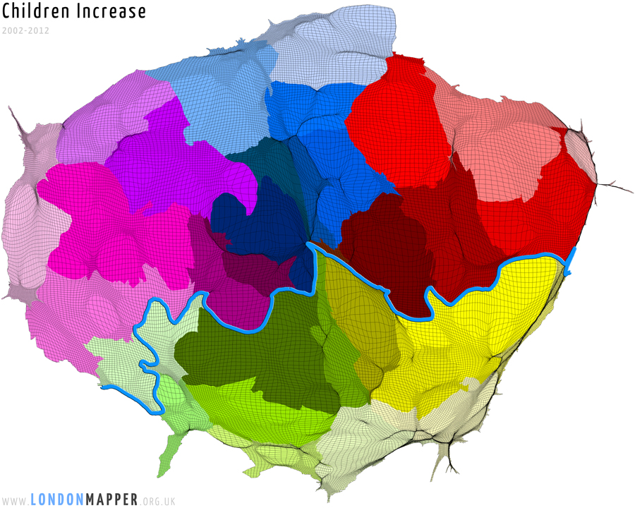
Between the last two censuses the largest increase in school-aged children in the UK was in London. Mid year estimate for more recent years present an even greater increase. Between 2002 and 2012 the number of children ages 0 to 15 in the capital rose from around 1.5 million to 1.7 million, an increase of 15%. The largest increases in children living in any particular wards were recorded in Thamesmead Moorings (Greenwich); Woolwich Riverside (Greenwich); East Acton (Ealing); Canning Town South (Newham); Gascoigne (Barking); Kilburn (Camden); and Stratford (Newham). In general the increase in children living in London has been greatest in the East, and it has been greater than for other age groups.
 View map details
Proportionately, in both Barking & Dagenham to the East, and Westminster in the centre an extra 1 in every 100 residents of each borough were school-aged children in 2011 as compared to the proportion of that age group in 2001. These were the largest two increases in the country between census years but left those two boroughs with very different shares of their population being of these ages: 23% in Barking & Dagenham but just 13% in Westminster were aged 4 to 18 by 2012 (note that many young people are still at school at age 18). In absolute terms these two boroughs had similar increases of 6,660, and 6,575 respectively – enough extra children in each to require two extra 10 form secondary schools and many more primaries in each borough. But these are not the largest absolute increases that were experienced across all of the capital as the map above makes clear. Across the capital as a whole some 117,000 extra school-aged children had to be catered for (net). The map above also includes children too young to yet go to school. There has been a very large increase in children below school age living in London: a rise of 76,000 in the number of children aged under 3 between the 2001 and 2011 censuses, or 26%.
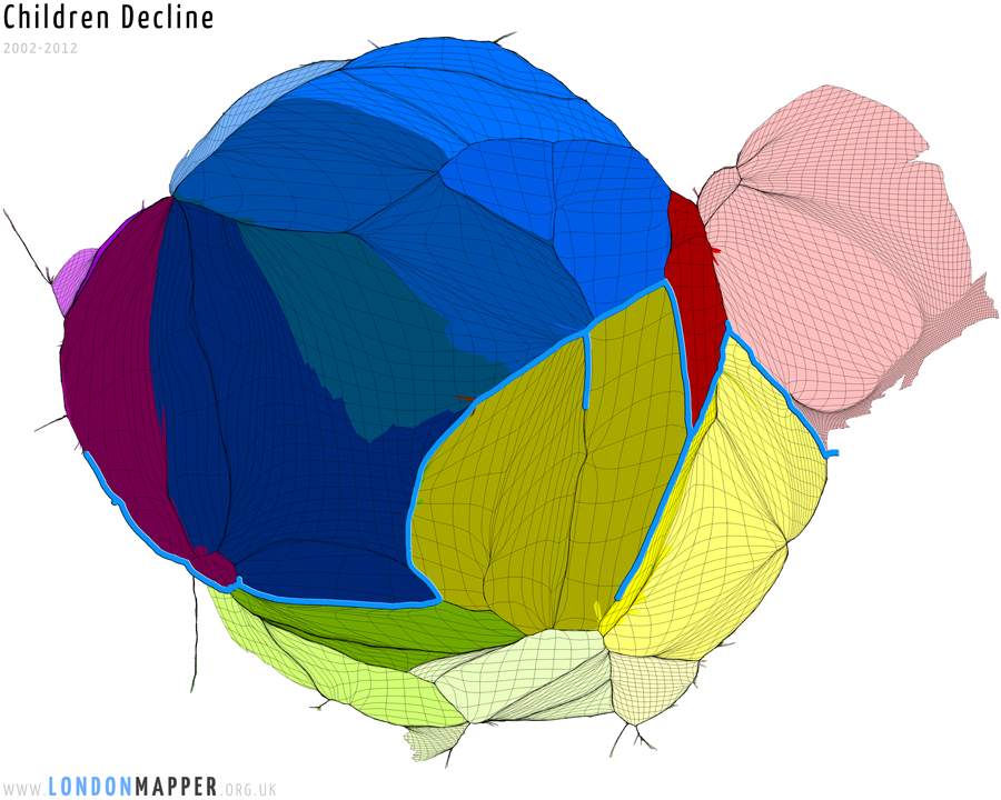
In the map the actual wards where the extra children of all ages are to be found have been made the size of the extra population of children. In contrast, the map below show those parts of London which have seen a decrease in children. These wards have only seen a reduction of 13,250 children in total between 2002 and 2012 and so you could draw the map quite small here to make it comparable with that above, but it is then harder to see the patterns. It should be noted that the biggest fails have been in some very affluent places such as Lancaster Gate as well as areas rapidly becoming more affluent such as (Hackney Central ward and Kings Cross ward).
 View map details
One reason for the general increase in children in London might be that families that would normally have migrated outwards between 2002 and 2012 were not able to due to the housing market crash of 2008. However there is also rapid churn in London as the proportion of children who are renting privately increase and so it is hard to be precise about the mechanisms. If families who might have moved out do stay for longer, their children are more likely to become settled and now they are less likely to move if they can avoid moving. One reason for the fall in the areas shown above is that the power of gentrification in these places was so great that even though many more families with children needed to stay in London during this period because of the housing crisis, and despite their demand for space, they could be squeezed out of these areas due to just having less money than people without children who wanted to buy or rent property here.
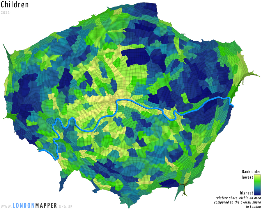
When we draw a map of London showing the proportion of children living in each place in 2012, such as that shown below, it becomes clear that children – despite growing greatly in number in the capital – are still very strongly squeezed out of the centre of London and that the greatest concentration of young people is now in the East. The cartogram below uses the overall population of the capital to create the underlying map projection in which each grid square is made proportional to the population of all ages living in that square. After that resizing, the square is coloured in according to whether the ward the square falls in has a high (blue), low (yellow) or average (green) proportion of children living in that area.
 View map details
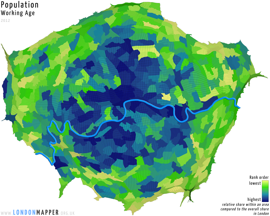
Compare the map above with the map below which shows which areas have the highest and lowest proportion of people of working age in them. It looks just like the mirror image of the map of children, but in fact it overlaps a lot because it is usually working-age people who have and live with children. This map uses exactly the same base map as that directly above.
 View map details
To complete this trilogy here is where most older people live – on the edge or in the very centre:
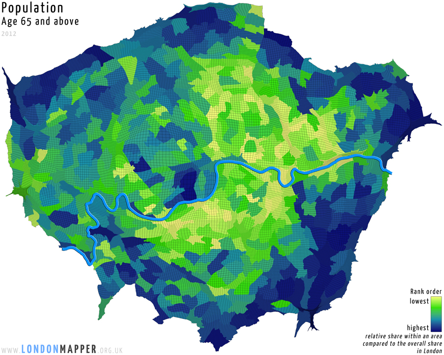 View map details
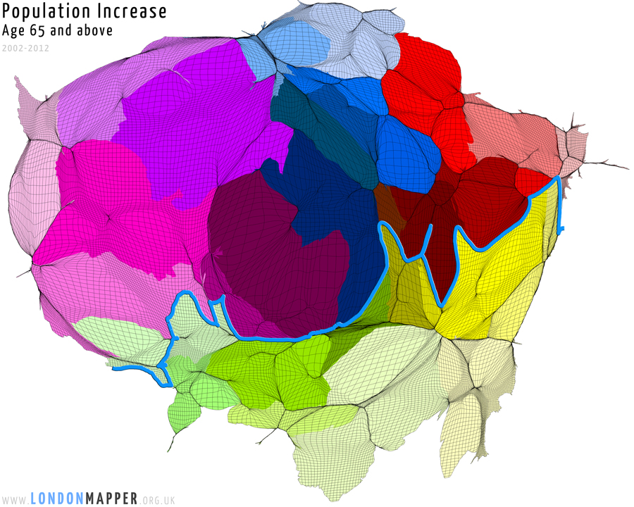
The population who are older (aged 65 or over) is almost static in the capital, so as a proportion of the population their share is falling. In 2002 some 0.89 million Londoners were aged 65+; by 2012 that figure had increased to just 0.90 million. However this small change disguises a much bigger shift in where older people live in London, with growing numbers of people of retirement age living in areas like Knightsbridge and Belgravia (which had one of the top ten increases in the 65+ population of any ward in the Capital). In those areas where it rose, the elderly population increased by over 51,000 people in total in these areas:
 View map details
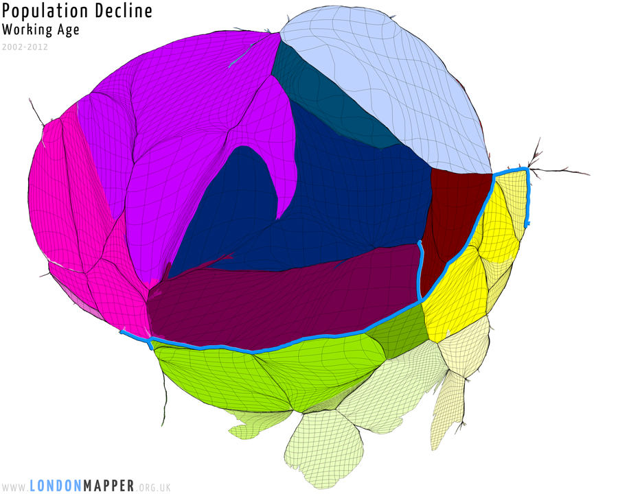
The working-age population fell in many of these same areas, still concentrated in the West End, but also in a string of wards to be found just south of the river. The map below shows where it fell, but note that it fell by only 14,000, so by less than the influx of older people into these more atypical parts of London. The building of new office space along the Thames have also have displaced people.
 View map details
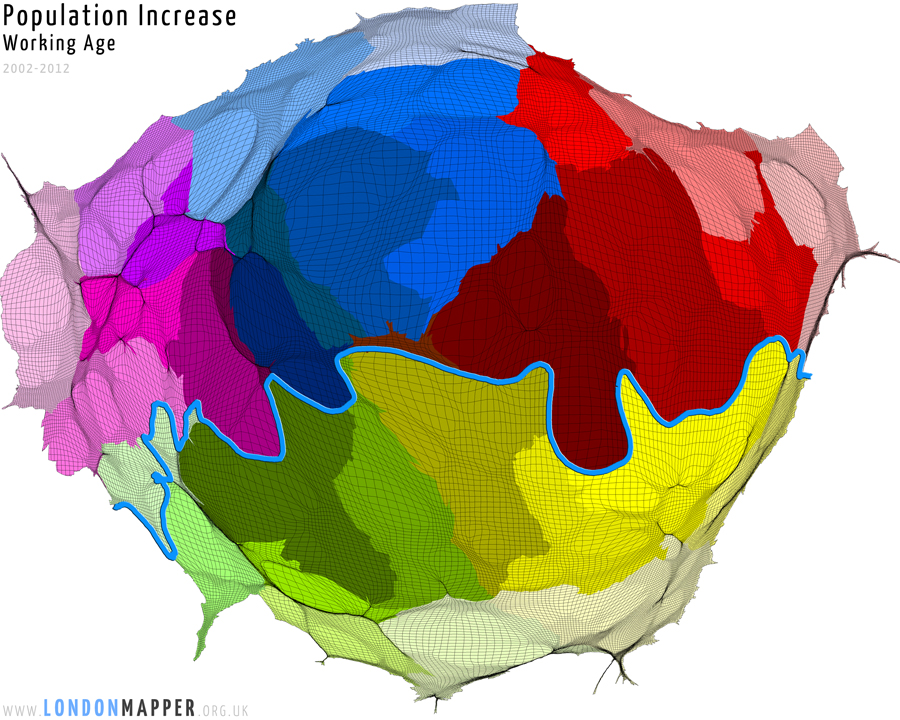
The 65+ population fell by 41,750 in a different set of areas (not shown) – but similar to where the working-age population of London increased the most in this period (shown below), which was towards the centre and the East, but not much in the West. The map below represents areas sized by where the net increase of over half a million working-age people occurred. The largest increase of all was an extra 7,800 adults aged 18-64 squeezing into Millwall ward, taking its population up to 18,600 by 2012. This is a 72% increase in just a decade and all occurring within that U shaped loop of the river Thames made so famous by the opening credits of East Enders.
 View map details
London is changing it demographic shape, but not so rapidly that it quickly becomes unrecognisable. Comparing London as shaped by its children, working age, and elderly populations, shows us some striking differences. Those differences have highlighted in the maps above, and the changes that are helping to bring them about has been focussed on; but the 2012 maps are not that very different from those that could be drawn a decade earlier. The working-age population has risen from 5.0 to 5.5 million, a 10% rise in just 10 years. The proportion of children rose even faster, from 1.47 to 1.68 million, or by 15% in those ten years. In contrast the increase amongst older people has been just 1% in over the same decade.
The table below taken from the UK Census shows the boroughs of London sorted by how great the increase in children aged under 3 has been in % terms, followed by the numbers of babies and toddlers in each area in both 2001 and 2011 and the total change in absolute numbers of children who needed midwives, health visitors, social workers, nursery teachers and who will need primary school teachers, space to play, youth centres, youth services and so much more in the very near future. Much of which is being cut due to austerity.
| % change | Borough (children aged 0-2) | 2001 | 2011 | change |
| 57% | Barking & Dagenham | 7153 | 11244 | 4091 |
| 43% | Hounslow | 8571 | 12232 | 3661 |
| 42% | Redbridge | 9132 | 13002 | 3870 |
| 41% | Brent | 9821 | 13835 | 4014 |
| 39% | Harrow | 6947 | 9658 | 2711 |
| 37% | Waltham Forest | 9362 | 12829 | 3467 |
| 37% | Enfield | 10782 | 14774 | 3992 |
| 37% | Greenwich | 9430 | 12882 | 3452 |
| 35% | Westminster | 5956 | 8029 | 2073 |
| 34% | Ealing | 11648 | 15604 | 3956 |
| 33% | Wandsworth | 10537 | 14015 | 3478 |
| 32% | Barnet | 12102 | 15955 | 3853 |
| 30% | Tower Hamlets | 9044 | 11728 | 2684 |
| 27% | Croydon | 13366 | 16927 | 3561 |
| 26% | Lewisham | 10846 | 13629 | 2783 |
| 26% | Haringey | 8886 | 11156 | 2270 |
| 25% | Newham | 12421 | 15588 | 3167 |
| 25% | Hillingdon | 9528 | 11947 | 2419 |
| 24% | Southwark | 10503 | 13042 | 2539 |
| 23% | Kingston upon Thames | 5527 | 6774 | 1247 |
| 19% | Merton | 7729 | 9193 | 1464 |
| 19% | Lambeth | 10944 | 13006 | 2062 |
| 18% | Hammersmith & Fulham | 6424 | 7572 | 1148 |
| 18% | Hackney | 10131 | 11939 | 1808 |
| 16% | Richmond upon Thames | 7469 | 8669 | 1200 |
| 14% | Bexley | 7912 | 9043 | 1131 |
| 13% | Islington | 6824 | 7696 | 872 |
| 12% | Sutton | 6947 | 7766 | 819 |
| 12% | Camden | 7397 | 8249 | 852 |
| 11% | Havering | 7307 | 8126 | 819 |
| 9% | Bromley | 11089 | 12093 | 1004 |
| 3% | City of London | 159 | 163 | 4 |
| -10% | Kensington & Chelsea | 6235 | 5634 | -601 |
Only in Kensington and Chelsea are the numbers of very young children actually falling. This is in the one London borough that makes the least use of many state services, especially when it comes to schools and hospitals. Demography matters.