Demographies of London: The younger ages
[h4]London’s Demography – up to age 30[/h4]
by Benjamin Hennig and Danny Dorling
So, what has happened in London in the noughties? Who has gone where, who as come in, going out just total numbers and then by age?
Almost 8.2 million people were living in London in 2011. Here is a picture of the capital of the Uk drawn with the boroughs sized by the number of people in each. The little map in the bottom right hand corner below is an equal land area map of London. Inner London is smaller in that. The little blue-green map in the top right shows which areas had the most people, a few of the outer London boroughs were most populous. But how have things changes to get us to this point?
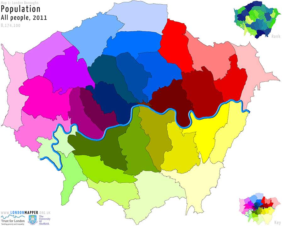
Map of [colored]Borough Population[/colored]
[dropcap1][colored]T[/colored][/dropcap1]his map shows the boroughs of London resized according to the total number people living there in the year 2011.
The total number of people represented in the map is 8,174,100.
The rank map shows areas ordered by the number of people in a borough as a share of all people in London in that year (going from yellow for the lowest ranks via green to blue for the highest ranks). The key map is a conventional land area map of London showing the boroughs in the colour scheme used in the main map.
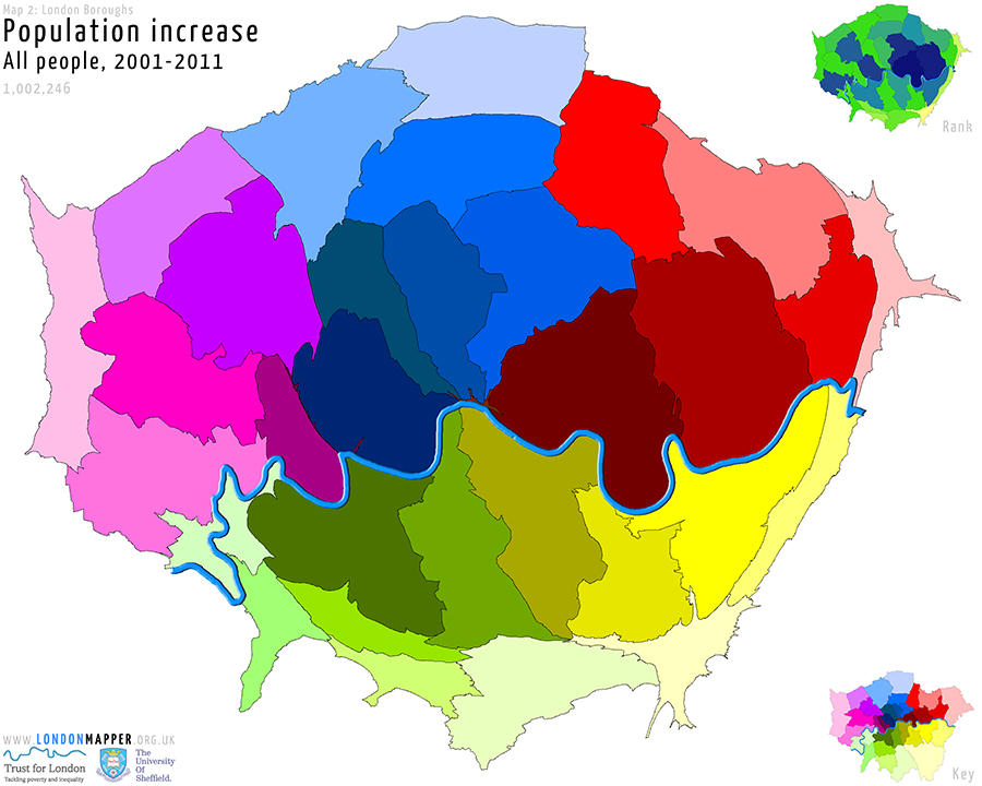
Map of [colored]Borough Population Increase[/colored]
[dropcap1][colored]T[/colored][/dropcap1]his map shows the boroughs of London resized according to the total population increase there between the years 2001 and 2011.
The total number of people represented in the map is 1,002,246.
The rank map shows areas ordered by their change in share of that age group in a borough as a proportion of the total population in a borough in that period (going from yellow for the lowest ranks via green to blue for the highest ranks). The key map is a conventional land area map of London showing the boroughs in the colour scheme used in the main map.
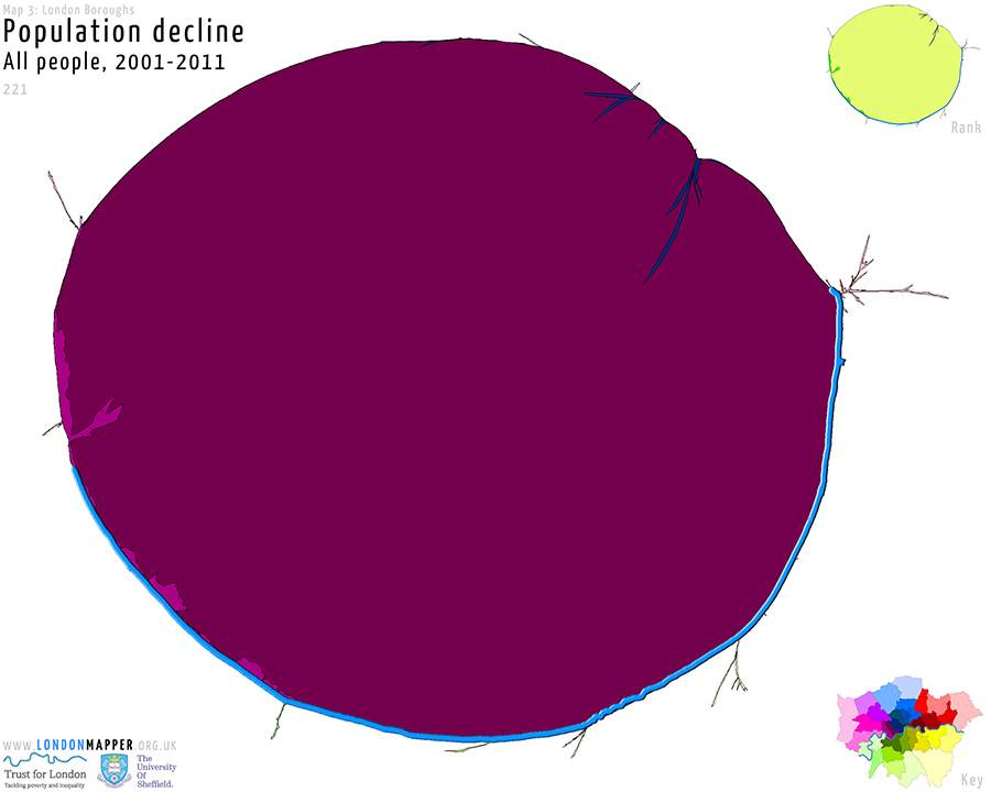
Map of [colored]Borough Population Decline[/colored]
[dropcap1][colored]T[/colored][/dropcap1]his map shows the boroughs of London resized according to the total population decline there between the years 2001 and 2011.
The total number of people represented in the map is 221.
The rank map shows areas ordered by their change in share of that age group in a borough as a proportion of the total population in a borough in that period (going from yellow for the lowest ranks via green to blue for the highest ranks). The key map is a conventional land area map of London showing the boroughs in the colour scheme used in the main map.

Map of [colored]Borough Population Decline Age 0-4[/colored]
[dropcap1][colored]T[/colored][/dropcap1]his map shows the boroughs of London resized according to the total population decline age 0-4 there between the years 2001 and 2011.
The total number of people represented in the map is 803.
The rank map shows areas ordered by their change in share of that age group in a borough as a proportion of the total population in a borough in that period (going from yellow for the lowest ranks via green to blue for the highest ranks). The key map is a conventional land area map of London showing the boroughs in the colour scheme used in the main map.
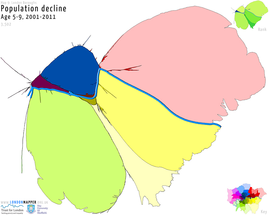
Map of [colored]Borough Population Decline Age 5-9[/colored]
[dropcap1][colored]T[/colored][/dropcap1]his map shows the boroughs of London resized according to the total population decline age 5-9 there between the years 2001 and 2011.
The total number of people represented in the map is 3,502.
The rank map shows areas ordered by their change in share of that age group in a borough as a proportion of the total population in a borough in that period (going from yellow for the lowest ranks via green to blue for the highest ranks). The key map is a conventional land area map of London showing the boroughs in the colour scheme used in the main map.
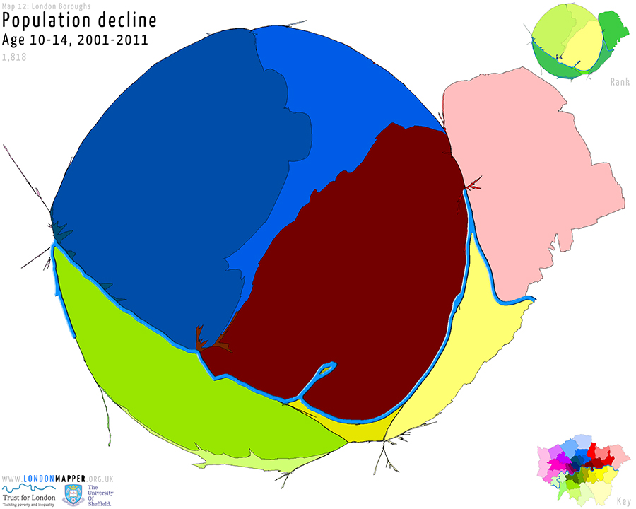
Map of [colored]Borough Population Decline Age 10-14[/colored]
[dropcap1][colored]T[/colored][/dropcap1]his map shows the boroughs of London resized according to the total population decline age 10-14 there between the years 2001 and 2011.
The total number of people represented in the map is 1,818.
The rank map shows areas ordered by their change in share of that age group in a borough as a proportion of the total population in a borough in that period (going from yellow for the lowest ranks via green to blue for the highest ranks). The key map is a conventional land area map of London showing the boroughs in the colour scheme used in the main map.
Some 100,000 people aged 20-24 and, showing a very similar pattern, 144,00 aged 25-29.
But there is so much more to say…to be continued.
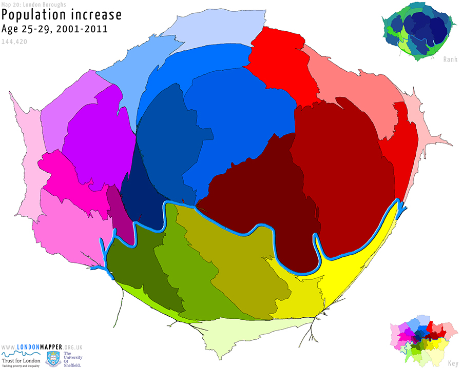
Map of [colored]Borough Population Increase Age 25-29[/colored]
[dropcap1][colored]T[/colored][/dropcap1]his map shows the boroughs of London resized according to the total population increase age 25-29 there between the years 2001 and 2011.
The total number of people represented in the map is 144,420.
The rank map shows areas ordered by their change in share of that age group in a borough as a proportion of the total population in a borough in that period (going from yellow for the lowest ranks via green to blue for the highest ranks). The key map is a conventional land area map of London showing the boroughs in the colour scheme used in the main map.