Borough Middle Change Rank 1980-2010
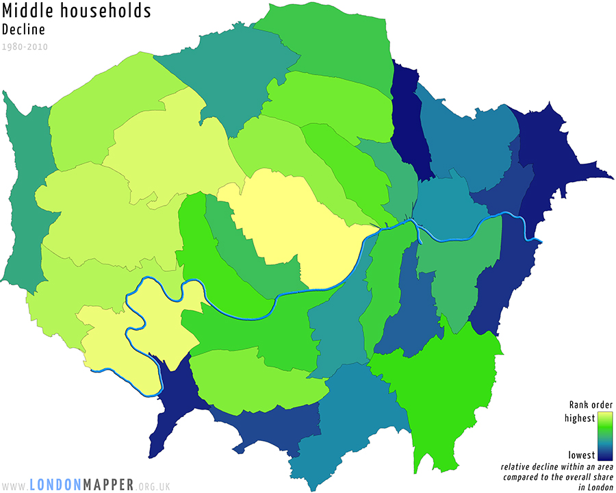
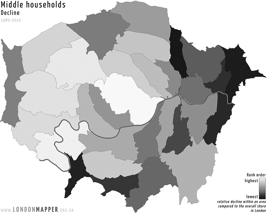
[colored]Middle Households Change Rank Order[/colored]
[dropcap1][colored]T[/colored][/dropcap1]his map shows the boroughs of London resized according to the total change in the number of middle households (neither poor nor rich) between 1980 and 2010. The rank colours show the areas ordered by the relative change of this group (going from yellow for the lowest via green to blue for the largest changes across the city).
See also:
Middle households Rank 1980
Middle households Rank 1990
Middle households Rank 2000
Middle households Rank 2010
[h5]Go To Main Topics[/h5]