Reference map
[dropcap1]L[/dropcap1]ondonmapper uses cartograms to visualise the social dimensions that shape the city. Some cartograms may be very distorted so that the following guide map containing labels for the Boroughs of London will help you to read the colours correctly in other maps on this website. Below you also find a ‘normal’ land area map of London if you need further help to adjust your eyes to a cartogram projection. The Reference Map button brings you to this page from every individual map page (use the browser back button to go back to the map that you have been on).
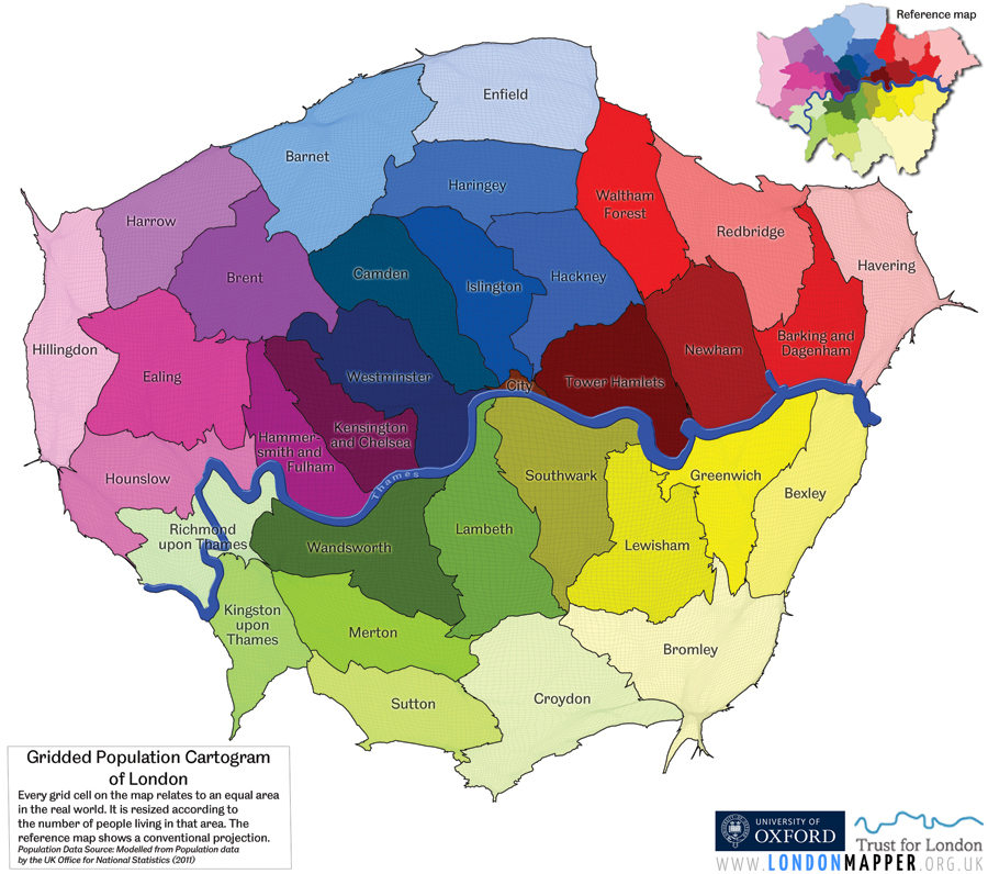
Gridded Population Cartogram
This map may look a little strange. That is because it is drawn on a projection that gives everyone equal space on the map – a detailed population cartogram of London (Data source: Office for National Statistics 2011). The colours of the different boroughs as labelled in this map are always the same in the maps on Londonmapper, so that you need to remember these colours once to be able to read maps that look even more strange than this one. Use this map as a guide for the other maps.
Map types featured on Londonmapper
Borough maps
 The borough maps are cartograms that resize the boroughs of London according to the topic of the map. These are based one single number for each borough, thus are the maps which provide the most general overview of how London is structured. These maps use the Londonmapper colour scheme shown in the map above allowing the boroughs to be identified in the map image.
Grid maps
 Grid maps are based on a gridded cartogram transformation of a certain topic. These provide the most detailed cartogram perspective of a topic because they show each individual grid cell in the map resized according to the information that is displayed in the map. The larger a grid cell, the higher is its corresponding data so that the dominating areas of a certain topic are shown as the largest areas in the map. Grid maps use the Londonmapper colour scheme shown in the map above allowing the boroughs to be identified in the map image.
Ward maps
 The gridded population cartogram shown above is the basis for the ward maps. Each ward map therefore shows London in its population shape, meaning that the least populated areas disappear from the map, while the most densely populated parts of the city are the largest areas in this map. The ward maps include an additional choropleth layer showing additional information in relation to the population distribution. A legend in each map explains, what information the colours in the map show.
Rank maps
![]() Rank maps are an alternative map display of the Borough- and Grid maps. They provide additional statistical detail, while at the same time are more abstract with their yellow-green-blue shadings. These visualise how the particular topic is distributed in relation to relative shares across the city. The colours show the areas ordered by their particular shares so that unusual patterns in the distribution of the data become visible (going from yellow for the lowest via green to blue for the highest shares).
Rank maps are an alternative map display of the Borough- and Grid maps. They provide additional statistical detail, while at the same time are more abstract with their yellow-green-blue shadings. These visualise how the particular topic is distributed in relation to relative shares across the city. The colours show the areas ordered by their particular shares so that unusual patterns in the distribution of the data become visible (going from yellow for the lowest via green to blue for the highest shares).
Reference map
 The reference map button brings you straight to this page here and allows you to compare the maps shapes to a population cartogram of London. The reference map also contains labels for the boroughs which have been removed in the other maps on this website to not obstruct the actual map image. Once you are familiar with the colours for each borough, you will be able to read the cartograms much easier.
File formats
All maps are provided in three different file formats and sizes. On the actual map page you see a small size version of the map. By clicking at it or selecting the Zoom button you will view a larger size version of the map overlaid on the webpage, which can be closed again by clicking outside the map or using the X button. Each map can also be downloaded in a high-resolution version as a 300 dpi RGB tif file (TIF button) and a 300 dpi greyscale file (Grey button), which can be used for printing our other design purposes. The maps may be used free of charge for non-commercial purposes under a Creative Commons license (CC BY-NC-ND 3.0 – Attribution-NonCommercial-NoDerivs 3.0 Unported). Any commercial use requires a permission (see contact details here).
A ‘normal’ view of London: Equal-area map
While most of the maps here are better compared to a population cartogram because they relate to something that has to do with people rather than land, it may sometimes be convenient to be reminded of the ‘normal’ shape of London. This is how London looks on a normal land area map:
