Inequalities in London
[h4]An Introduction[/h4]
by Benjamin Hennig and Danny Dorling
London has fascinated people for centuries. The city survives by drawing people in. Far too few are born in London to sustain its population. London has always relied on in-migration to survive. Immigration has been essential for London to grow. London has also always needed people to be optimistic to travel to the Capital. It still draws many in with promises for future fortunes to be made.
We tend to only remember life’s winners. In the 1350s a boy was born in Pauntly in Gloucestershire and christened Richard. He travelled to London to be an apprentice, he became a master craftsman, then wealthy, and then he became Lord Mayor of London. It was easier then too to become a politician if you had money. In fact he became London Mayor four times over. Only one person can be Mayor at any one time and if someone becomes Mayor more than once that is less opportunity for all the rest, but sadly the rest don’t tend to be remembered.
Richard Whittington’s story is remembered today by the tale of Dick Whittington, who believed the streets of London to be paved with gold and who went there and did make his fortune. In the past most youngsters travelling to London would never become rich, they simply couldn’t. Many would in fact die young from infectious diseases which have always been more prevalent in cities. Those who did not perish young would often live in poverty. However, on average, people moving to London have normally been a little healthier, taller, and had a little more ambition or fantasising about them than those who didn’t make that move and this has kept London vibrant and results in a continued influx to the always highly divided city.
How divided is London? A reports released by John Hill’s inquiry during 2010 revealed that the richest tenth of Londoners had recourse each to at least 270 times the wealth of the poorest tenth of Londoners. The very worse-off of that richest tenth held at least one million pounds in assets, often this included the value of their property and their future pension rights. Usually these people did not feel very well-off in London because the rest of the best-off tenth of Londoners were mostly so much richer than even they were. London is thought to be the home, and almost certainly contains the second or third of fourth or further homes, of more of the very richest people on the planet than any other city in the world.
We have to say “almost certainly” because the rich tend to be very secretive about their wealth. In contrast, statistics on the poor have usually been easier to obtain, but are still often contentious. London has been known for many years not only as a place of concentration of riches, but also as the home to the single greatest concentration of poverty to be found in Western Europe. This was recognized as long ago as 1987 when it was said that:
[blockquote6]“Although the percentage officially unemployed in Greater London is a little smaller than average for Britain the city holds the largest concentration of unemployed in the industrialised world, and the real total is at least 150,000 larger than the total of over 400,000 admitted by the Government.”
[Townsend P. with Corrigan P. & Kowarzik U. 1987 p.29][/blockquote6]
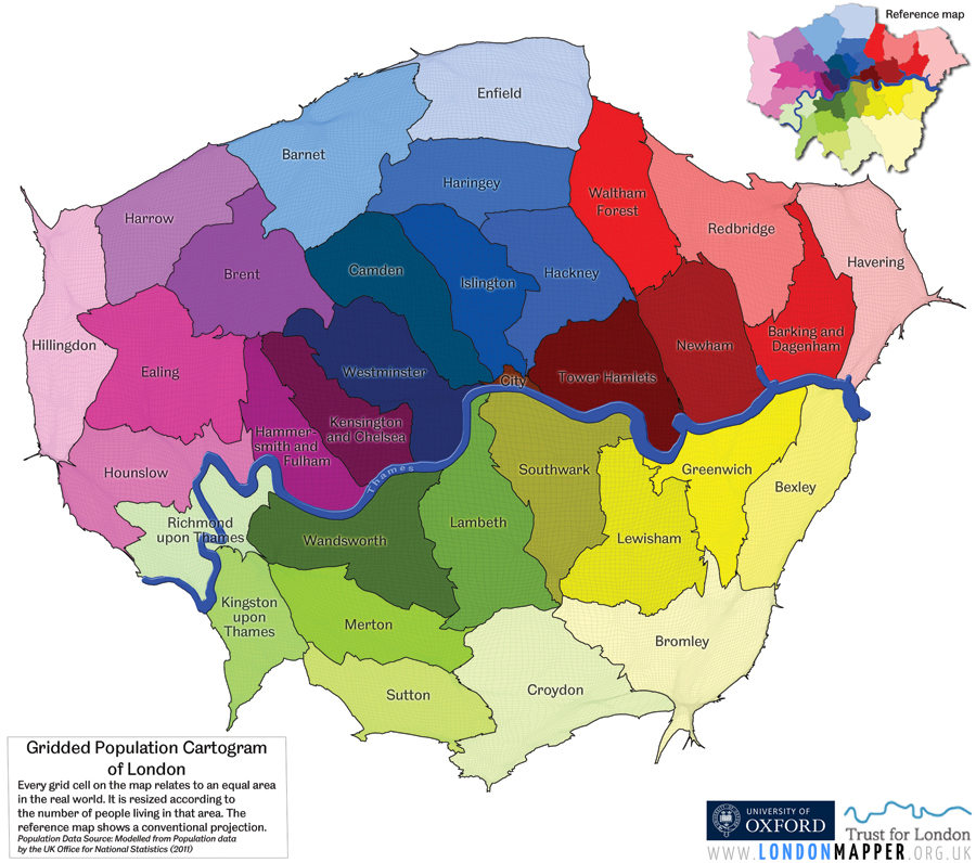
It is still very much the case today that London contains some of the largest numbers of very poor people in Western Europe, despite being its richest city. In this introduction we’ll look at five aspects of inequality in London concerning education, poverty, work, squalor and disease. We’ll concentrate on the geographical distributions of these inequality distributions and do this at the ward level, but within each ward there is far more further inequality than is found between wards, so what you see next is just the tip of the iceberg of extremes of life chances to be found today in London. Map 1 shows are the boroughs of London which the wards nest in displayed on an equal population projection in which the map is stretched according to the population distribution. We use this map as a basemap as is gives every Londoner the same amount of space and results in a fairer display of the realities that people live in.
If you have ever wondered what the pattern to school exam results looks like by the home location of every child. Map 2 shows this for London. Every ward is coloured by the average capped GCSE score (based on the best 8 results made by each pupil) of children taking those exams who live in that ward. Results tend to be lowest in East London, inner London just south of the river (Lewisham) and up through some particular Haringey and Enfield wards, but there are enclaves of low scores almost everywhere. Areas with high scores being, on average achieved, are harder to come by. They tend to be more common in outer boughs, but also in much Kensington and Chelsea and the southern end of Westminster. Usually there are green and yellow average wards in between these extremes, but not always.
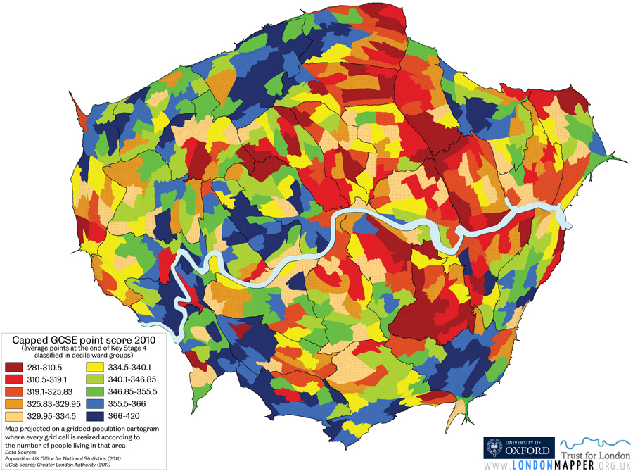
Map 2
Capped GCSE average point scores for pupils at the end of Key Stage 4 in maintained schools (referenced by location of pupil residence) based on ward-level data for 2010 projected on a gridded population cartogram (Data source: Greater London Authority 2011)
In London the 160,000 children growing up in the wards where the results are lowest tend to get an average point score of 304, just a fraction over getting 6 C’s a D and E. In contrast the same number of children living in the wards where results tend to be highest get an average score of 376, just a little bit better than 4 A’s, 2 B’s a C and a D.
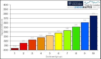 [blockquote4]Figure 1: GCSE scores of school children in London by GCSE decile ward group 2010 (Data source: Greater London Authority 2011)[/blockquote4]Figure 1 shows the average scores for each of ten groups of London children. It is worth noting that it is not a straight line relationship. Both the worse and best-off tenth stand out a little. This figure was used to decide how to colour in Map2 (above). Each of the ten groups of wards on that map contains the same number of children, all those with the most similar GCSE results by the area they live in.
[h4]Poverty[/h4]
How much might the difference between the average GCSE results by London ward be related to the extent of poverty and inequality that school children in London experience? It is harder to do well at school if you family have less, they can buy you fewer or no books and your parents may be less able to help you with your coursework. They might be less likely to have done coursework themselves.
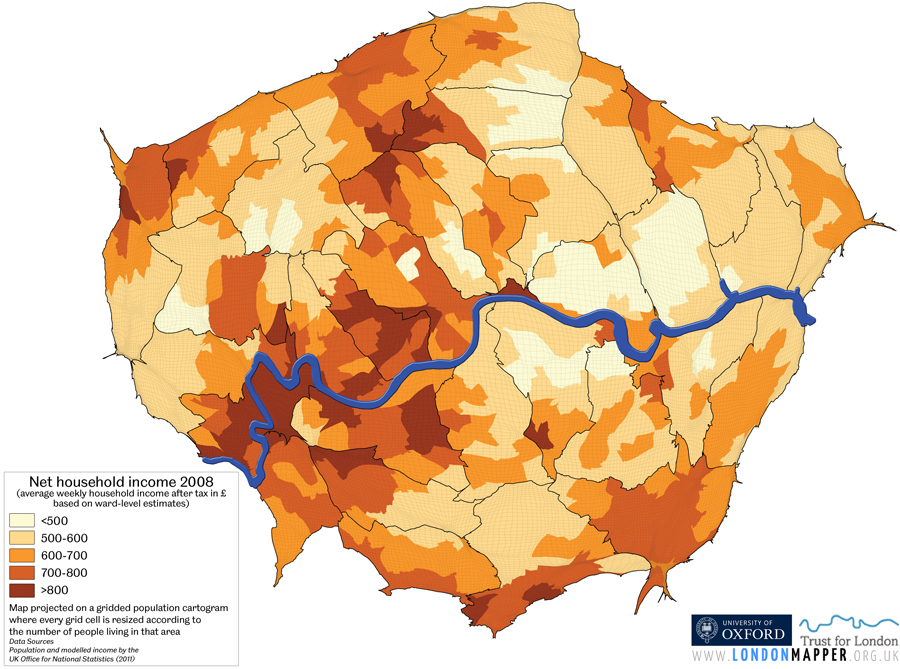
In map 3 we estimate whether children are living in poverty by whether they are either reliant on benefits including child tax credit or are in an out-of-work family. The map below shows where the highest and lowest proportions of children are estimated to be living in poverty and also which areas have average rates of around 20% to 30%. Not that poverty within London is a little more common for children in the Capital than elsewhere in Britain. Housing costs are higher in London and there are many very lowly paid jobs.
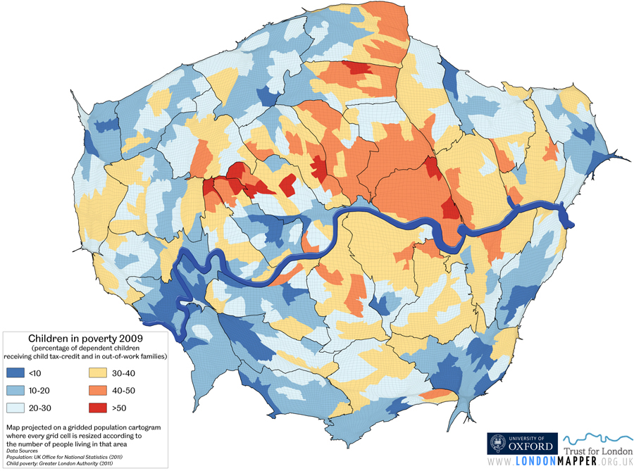
Map 3
The proportion of children living in poverty based on ward-level estimates for 2009 projected on a gridded population cartogram, map using the share of dependent children receiving child tax-credit and those in out-of-work families as a simple proxy (Data source: Greater London Authority 2011)
 [blockquote4]Figure 2: School children in London in poverty % by GCSE decile ward group 2010 (Data source: Greater London Authority 2011)[/blockquote4]
[h4]Pay[/h4]
The map of average pay in London (map 4) helps explain the map of poverty – it is largely low pay that puts households into poverty (see figure 3). Most children living in poverty have a parent living with them who is also earning. There is a campaign in London to spread a “living wage” so that fewer Londoners are only just getting by. It has been successful, but not successful enough yet.
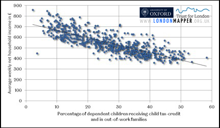 [blockquote4]Figure 3: Ward-level child poverty plotted against household income wealth (Data sources: Greater London Authority 2011, Office for National Statistics 2011)[/blockquote4]
Are a key reason why pay is so high in some areas. Map 5 (below) shows where bankers tend to live within London. These are highly ranked professionals working within the financial sector identified using 2001 census records.
Notice that a minority cluster very near to the towers in Canary Wharf – but not enough to significant alter the average pay of many wads there. Perhaps these are the lower paid bankers living near to work?

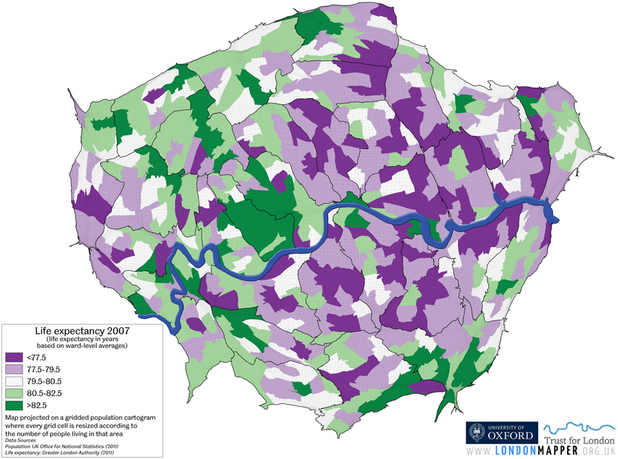
Finally – what about life expectancy? It varies too by about 5 years between the extremes. Map 6 (below) shows how this looks on the ground. It is from maps such as this that memorable statements are made about the extent of inequalities in the Capital and what they mean for entire populations who can expect to live much longer or shorter lives.
 [blockquote4]Figure 4: Differences in male life expectancy within a small area in central London (Image source: Kindly provided and printed with permission by the London Health Observatory)[/blockquote4]
[h4]Conclusion[/h4]
It is well know that London is a very divided city but the spatial divides, even at ward level, are rarely mapped. What is much more common is to hear of the gaps along the tube lines, “a year of life for every stop”. It is rarer to look at all places at once. It is even rarer still to consider these inequalities on a map that gives everyone equal space.
A divided London is an unjust London, but London has been divided for many centuries. What is of far greater concern than the divides is ascertaining whether they are growing or shrinking. Determining those changes depends not just on what you measure: exams, poverty, pay, bankers, or death? But also one how you measure it, at what point in time you start and stop, what statistics you use.
This introduction shows you where you need to start – to then begin to see how things are changing.
[h4]References[/h4]
[blockquote6]• Greater London Authority (2011). Ward Profiles 2011. http://data.london.gov.uk/datastore/package/ward-profiles-2011 (last accessed 2011-12-12).
• Humphries, J. and T. Leunig (2007). Was Dick Whittington Taller Than Those He Left Behind? Anthropometric Measures, Migration and the Quality of Life in Early Nineteenth Century London. London, Department of Economic History Working Paper 101, London School of Economics. http://www2.lse.ac.uk/economicHistory/workingPapers/economicHistory/2007.aspx (last accessed 2011-12-12).
• Office for National Statistics (2011). Neighbourhood Statistics. http://neighbourhood.statistics.gov.uk/dissemination/Download1.do (last accessed 2011-12-12).
• Townsend, P., Corrigan P. and U. Kowarzik (1987). Poverty and labour in London: interim report of a centenary survey, Survey of Londoners’ Living Standards no.1, Low pay Unit, Low Pay Unit and Poverty Research Trust, London.[/blockquote6]