Poverty and Wealth 1980-2010
[h4]Poverty and Wealth in England and London 1980-2010[/h4]
by Benjamin Hennig and Danny Dorling
Interactive Map Feature
Explore the data and maps from this analysis in our
![]() Interactive Map Feature: Poverty and Wealth in London
Interactive Map Feature: Poverty and Wealth in London
In 1983 poverty researchers in Britain pioneered the measure of a poverty threshold where a household was defined as poor if they lack necessities because they can’t afford them. What is deemed to be a necessity changes over time but the measure remains the same – a household is poor if it cannot afford necessities – and the population of the country is periodically surveyed to assess those goods and services which a majority consider to be necessities.
Poverty surveys were conducted in 1983, 1990, 1999 and 2012. These surveys have reported a growing number and proportion of households unable to afford basic items considered by most people to be necessities. The latest report for example found that in 2012, about 12 million people could not afford one or more essential household goods, like a telephone, washing machine or replacing or repairing broken electrical goods. In 1999, that was about 8 million; in 1990, about 6.5 million; and in 1983, nearly 3.5 million people.
Before the most recent poverty survey and census, and in collaboration with many colleagues from different universities we combined data from poverty surveys with census data to estimate the proportion of households in each small area of the country who were poor. The results of that study were published by the Joseph Rowntree Foundation in 2007 and also included a method for estimating how many households in each area were wealthy (defined as having equity in the housing they owned or were buying that exceeded current inheritance tax thresholds). Here we have updated that work using the 2011 census to present a contemporary picture and a long-term indication of changes over the generations.
Rich and Poor
The figures and maps we present below will underestimate the current extent of poverty because we are applying the equations produced in the 2007 Rowntree report to 2011 census data. We know that average incomes have fallen, that benefits have been cut that there have been many other detrimental changes since 2011, but the figures here provide the best picture we can currently produce of the geographical distribution of poverty and wealth which can be compared to the past. The estimates by wealth are far more up-to-date as we can use current house price data to update them.
Poor households are households living below a relative poverty line, and as such they are excluded from participating in the norms of society. The number of households are determined by a survey and then estimated for small areas using census data. The ‘norms of society’ are determined by the survey and change over time.
Wealthy are people with wealth over the inheritance taxation threshold. It is important to point out that the majority of wealthy families manage to spend or transfer their wealth before death and so don’t pay inheritance tax. Only a minority of these wealthy families actually pay that tax.
The remaining households are in what we call middle in this analysis.
Changes in Poverty and Wealth, 1980 to 2010
Across all of England the number of households who were poor, who could not afford at least three of more necessities rose from 17% in 1980 to 21% in 1990, to in 2010. By region households were most likely to be poor in London by 2010 (36% of all London households). The growth in poverty in London between 1980 and 2010 has been 80%.
The next highest rate of poverty was found in the North East (31%) and the lowest rate was in the South East (22%). Some 43% of households in Inner London are now poor. In 1980 and 1990 the region with the highest rate of poverty had been the North East.
Table: Households which are poor, in the middle, or wealthy – 2010 and 1980
| Area | Poor 2010 | Middle 2010 | Wealthy 2010 | Poor 1980 | Middle 1980 | Wealthy 1980 |
| Inner London | 43.1 | 37.5 | 19.4 | 28.2 | 65.4 | 6.4 |
| Outer London | 30.5 | 36.9 | 32.6 | 15.3 | 64.2 | 20.4 |
| London | 35.8 | 37.1 | 27.1 | 20.3 | 64.7 | 15.0 |
| North East | 31.0 | 60.9 | 8.1 | 20.7 | 71.7 | 7.6 |
| North West | 28.7 | 56.9 | 14.4 | 17.7 | 69.9 | 12.4 |
| Yorkshire & Humber | 28.1 | 57.1 | 14.8 | 17.7 | 70.2 | 12.1 |
| East Midlands | 25.2 | 55.3 | 19.5 | 15.8 | 67.8 | 16.4 |
| West Midlands | 28.1 | 52.3 | 19.5 | 17.1 | 68.9 | 14.1 |
| East | 23.3 | 45.1 | 31.6 | 13.9 | 63.6 | 22.5 |
| South East | 22.2 | 41.3 | 36.5 | 13.3 | 60.1 | 26.6 |
| South West | 22.8 | 43.8 | 33.4 | 13.9 | 55.9 | 30.2 |
| England | 27.2 | 48.4 | 24.4 | 16.6 | 65.5 | 17.9 |
In 1980 two-thirds of households in England were in the middle of the distribution being neither rich, nor poor. By 2010 only 48% were in the middle. The greatest change has been in London where only 37% of households are now neither rich nor poor.
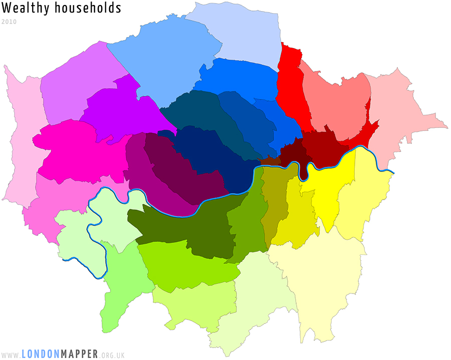
A third of households in Outer London are now rich by dint of either owning their property outright or having paid off most of a mortgage on that property. Less than a fifth of households in Inner London are rich because so many rent and so many of the minority who buy have huge debts and have not paid off much of their mortgage yet. The wealthy in London have grown by 80% between 1980 and 2010.
Regional change in poverty and wealth, England 1980 to 2010
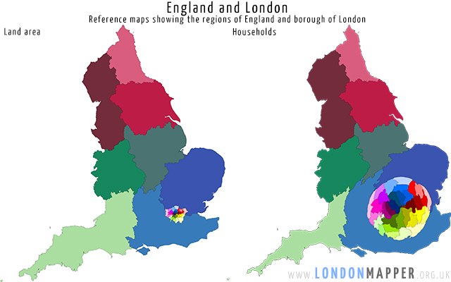
The map below shows the regions of England and boroughs of London each coloured separately. The population cartogram next to it shows the very same areas, but now with the area drawn in proportion to the population so London becomes much larger. We use this cartograms in the rest of the report because they highlight just how dramatic the changes have been in term of actual numbers of extra household who are now poor or wealthy and from which areas all the households in the middle have disappeared in greatest numbers.
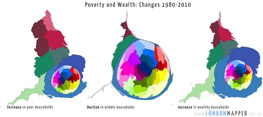
The three cartograms below are sized: firstly by the number of additional poor households living there between 1980 and 2010, an additional 3.2 million across all of England; secondly by the decline in the number of households who are neither rich nor poor – a fall of 265,000 across the country almost all of which has been concentrated in London; and thirdly the rise in wealthy households of which there has been an increase of 2.4 million over the course of the last generation, the roughly 30 year period 1980-2010.
Change in Poor/Middle/Wealthy Households 1980-2010
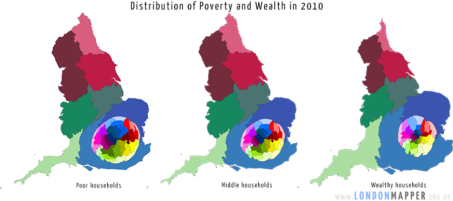
These dramatic changes have resulted in the distribution shown in the next three maps for 2010 where London now has the smallest proportion of households who are neither poor nor rich. Nationally some 48% of households are now in the middle, but in London that proportion is now 37%, in 1980 it was 65%, some two in three households in London used to be in the middle; today that proportion is shrinking towards just one in three London households being neither rich nor poor; some 36% being poor and around 27% being asset rich. It is London which has experienced the most dramatic change in all of England.
Poor/Middle/Wealthy Households 2010
The changing patterns of rich and poor within London
The cartograms below shows each borough of London drawn with is area in proportion to the number of households who were rich or poor in 2010. It is worth noting that although all the maps are drawn with the same overall area here there are far more poor household in London than wealthy households. The cartograms are like pie charts showing the share of the proportion of each group in each place. A greater share of London’s poor still live in the centre and east of the capital than on the outskirts; but these distributions are changing as the sizes of the groups also change.
 Poor: 36% of all households in 2010 |
 Rich: 27% of all households in 2010 |
Wealthy, poor, and households in the middle are found living in all the boroughs of London but the proportions have changed rapidly in recent decades. If we colour the two maps above by the proportions of households that are wealthy and poor in each borough it is clear to see that the poorer households are still concentrated in Inner London, towards the East while large numbers of richer households are found in much higher numbers in three parts of Outer London. Westminster and Kensington and Chelsea do feature less obvious in the mapping of areas of concentrated wealth as such a high proportion of people who live there are renting. Many of the richer households may not consider themselves to be that rich, but their net equity today means that they are very wealthy compared to most people living in Britain.
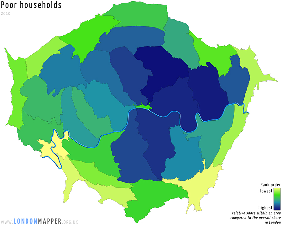 Rank order of share of Poor Households: 36% of all households 2010 |
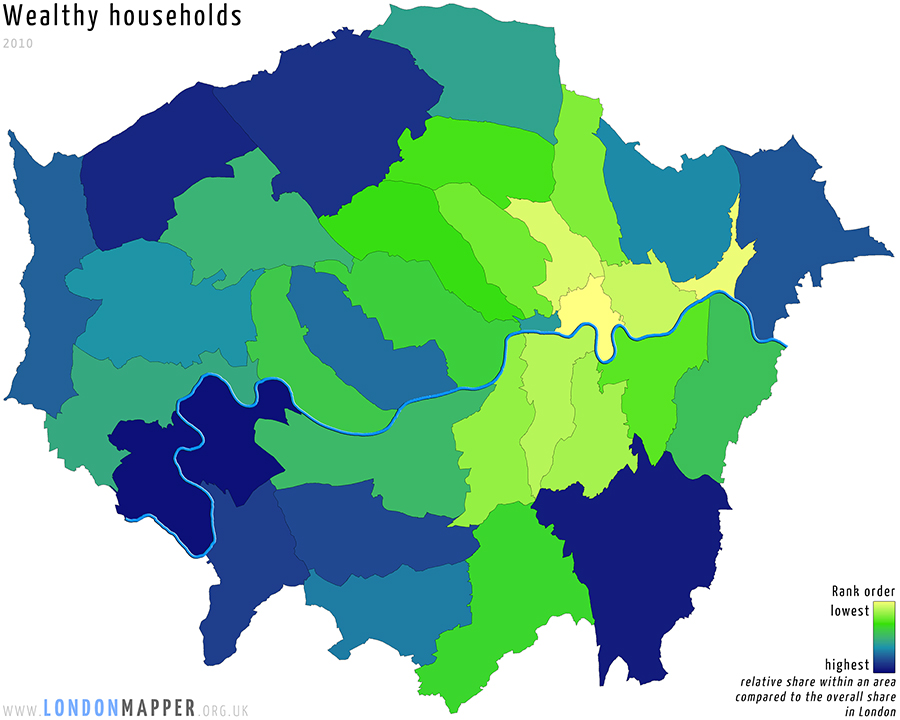 Rank order of share of Wealthy Households: 27% of all households 2010 |
The final two pairs of London maps show which parts of the capital have had the largest increases in the proportions of households that have now poor or wealthy. Poverty has grown in the East, but also just North and West of the centre of London. That growth in poverty is partly hidden by the growth in wealth of many other households living in the same areas. Similarly the growth of wealth within many areas of the centre of London, as well as the South West can be obscured by growing rates of poverty in the centre.
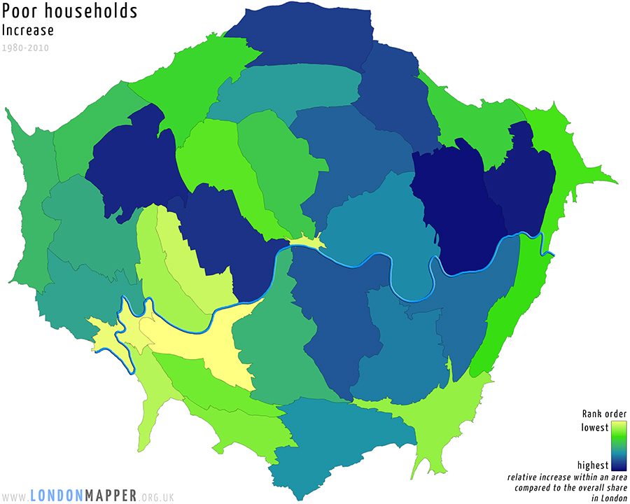 Growth in Poverty: 16 percent point increase of all households 1980-2010 |
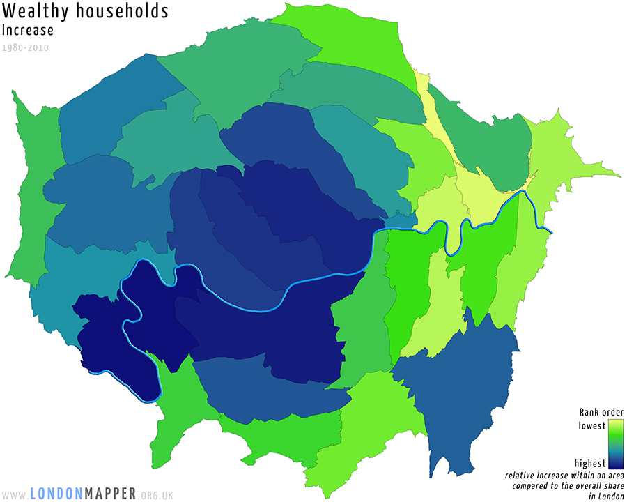 Growth in Wealth: 12 percent point increase of all households 1980-2010 |
The map of London shown below is perhaps the most important. It shows how much of the decline in households in the middle has occurred in each borough between 1980 and 2010. The largest falls in the proportions of households that are neither wealthy nor poor has been in outer boroughs.
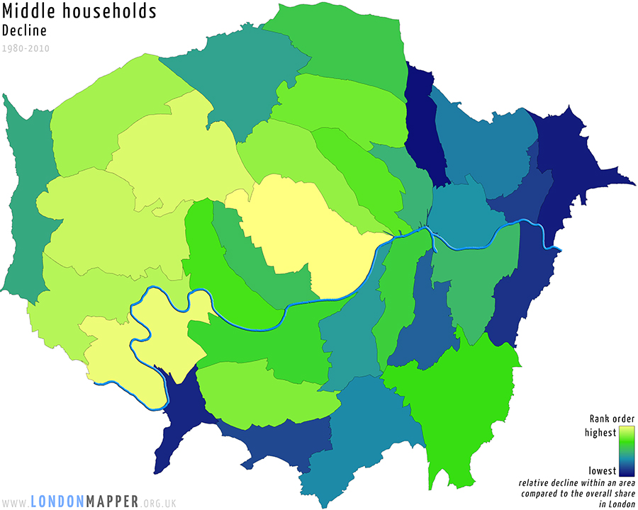 Decline in the Middle: 28 percent point decline of all households 1980-2010
The largest fall in households in the middle has been in Westminster, a 40 percent point decline as compared to 1980. The largest increase in wealthy households has been in Richmond, a 32 percent point rise in 30 years, an extra three out of every ten households; and the largest percent point increase in poverty has been in Newham, where almost 1 out of every 2 households are now poor, making Newham the second poorest borough in London to Hackney, closely followed by Tower Hamlets with similar levels.
 Reference map of boroughs with area in proportion to households
Technical notes
In our analysis we refer to the years being mapped as 1980, 1990, 2000 and 2010 because we are mixing data from around and just after each of those years to produce the estimates. For the wealth estimates housing price data from 2011 was used. In all of London housing prices have risen rapidly since 2011 so more households, which we currently not labelled as wealthy, will have become wealthy and the middle with have shrunk between 2011 and 2015. However, we rely on census data to update the estimates as only the census tells us how many people own outright, have a mortgage, or are renting in each area. And the last census was taken in 2011.
The following descriptions are modified excerpts from
Dorling, D., Rigby, J., Wheeler, B., Ballas, D., Thomas, B., Fahmy, E., Gordon, D., and Lupton, R. (2007): Poverty, wealth and place in Britain, 1968 to 2005. Bristol: Policy Press. (http://www.jrf.org.uk/sites/files/jrf/2019-poverty-wealth-place.pdf)
The methodology used to estimate the number of breadline poor households for each area for each time period is well established and has been used previously for similar research, as described above. This approach is increasingly being used elsewhere for poverty measurement, for example by the Department for Work and Pensions (DWP, 2002). For our study, the method is extended to earlier poverty surveys and censuses to create a consistent time series across the three decades. The methods used with the 1990 and 1999 Poverty Surveys have been described in detail previously (Gordon and Pantazis, 1997; Gordon et al, 2000). The methods developed here for the 1968 and 1983 Surveys are very
similar, and are described in the original report.
In essence, the method uses the information from a detailed poverty survey, carried out on a sample of 1,000 or 2,000 households, to classify each household in the survey as ‘poor’ or ‘not poor’. The survey also includes information comparable to that collected by the census, such as household composition, tenure, car ownership and social class. The survey data can then be analysed to assess the relationship between these census-type variables and the poor/not poor classification of households in the survey. These relationships are applied to census data to estimate the number of poor households in each area for which census data is available. For example, the analysis of the 1999 Poverty and Social Exclusion Survey indicated that the total number of breadline poor households was equal to the following:
57.6% of overcrowded households (more than one person per room) +
35.7% of households renting from local authorities or housing associations +
32.4% of lone-parent households +
30.3% of households with an unemployed Household Reference Person (HRP) +
18.4% of households with no car +
16.5% of households renting from private landlords +
16.1% of households with a member with a limiting long-term illness +
13.5% of households with no central heating or without sole use of amenities +
11.3% of households with HRP in a low social class (National Statistics Socioeconomic Classification [NS-SEC] 6, 7 or 8).
The asset wealth method uses tract-level data on housing wealth sourced from previous research by Thomas and Dorling (2004). For each year, for each tract, we have information on average house price by type of dwelling, and similarly the number of homes that are owned outright and being bought (with a mortgage) by type of dwelling. Using these data, for each tract we estimate the distribution of housing wealth, and subsequently the number of households with housing wealth exceeding a threshold considered to make that household wealthy. While the notion of what counts as ‘wealthy’ is slightly vague, and therefore contentious, we use the contemporary Inheritance Tax threshold as an indicator of asset wealth. Hence a household with sufficient total wealth for its estate to be liable to Inheritance Tax is considered wealthy.
The group labelled as middle in our analysis is that of the remaining households which are not in either the group of poor or wealthy households.
References
![]() Dorling, D., Rigby, J., Wheeler, B., Ballas, D., Thomas, B., Fahmy, E., Gordon, D., and Lupton, R. (2007): Poverty, wealth and place in Britain, 1968 to 2005. Bristol: Policy Press.
Dorling, D., Rigby, J., Wheeler, B., Ballas, D., Thomas, B., Fahmy, E., Gordon, D., and Lupton, R. (2007): Poverty, wealth and place in Britain, 1968 to 2005. Bristol: Policy Press.
![]() DWP (Department for Work and Pensions) (2002) Measuring child poverty: Consultation document, London: DWP.
DWP (Department for Work and Pensions) (2002) Measuring child poverty: Consultation document, London: DWP.
www.dwp.gov.uk/ofa/related/measuring_child_poverty.pdf, 26/06/2006
![]() Gordon, D. and Pantazis, C. (eds) (1997) Breadline Britain in the 1990s, Aldershot: Ashgate.
Gordon, D. and Pantazis, C. (eds) (1997) Breadline Britain in the 1990s, Aldershot: Ashgate.
![]() Gordon, D., Adelman, A., Ashworth, K., Bradshaw, J.R., Levitas, R., Middleton, S., Pantazis, C., Patsios, D., Payne, S., Townsend, P. and Williams, J. (2000) Poverty and social exclusion in Britain, York: Joseph Rowntree Foundation.
Gordon, D., Adelman, A., Ashworth, K., Bradshaw, J.R., Levitas, R., Middleton, S., Pantazis, C., Patsios, D., Payne, S., Townsend, P. and Williams, J. (2000) Poverty and social exclusion in Britain, York: Joseph Rowntree Foundation.
![]() Thomas, B. and Dorling, D. (2004) Investigation report: Know your place, London: Shelter.
Thomas, B. and Dorling, D. (2004) Investigation report: Know your place, London: Shelter.
http://england.shelter.org.uk/policy/policy-825.cfm/plitem/160, 27/04/2006
Get the Data
![]() Poverty and Wealth in London and England 1980-2010 (Excel file)
Poverty and Wealth in London and England 1980-2010 (Excel file)
Related maps
![]() Interactive Map Feature: Poverty and Wealth in London
Interactive Map Feature: Poverty and Wealth in London
![]() Middle households 1980: Borough; Borough Rank
Middle households 1980: Borough; Borough Rank
![]() Middle households 1990: Borough; Borough Rank
Middle households 1990: Borough; Borough Rank
![]() Middle households 2000: Borough; Borough Rank
Middle households 2000: Borough; Borough Rank
![]() Middle households 2010: Borough; Borough Rank
Middle households 2010: Borough; Borough Rank
![]() Middle households Change 1980-2010: Borough; Borough Rank
Middle households Change 1980-2010: Borough; Borough Rank
![]() Poor households 1980: Borough; Borough Rank
Poor households 1980: Borough; Borough Rank
![]() Poor households 1990: Borough; Borough Rank
Poor households 1990: Borough; Borough Rank
![]() Poor households 2000: Borough; Borough Rank
Poor households 2000: Borough; Borough Rank
![]() Poor households 2010: Borough; Borough Rank
Poor households 2010: Borough; Borough Rank
![]() Poor households Change 1980-2010: Borough; Borough Rank
Poor households Change 1980-2010: Borough; Borough Rank
![]() Wealthy households 1980: Borough; Borough Rank
Wealthy households 1980: Borough; Borough Rank
![]() Wealthy households 1990: Borough; Borough Rank
Wealthy households 1990: Borough; Borough Rank
![]() Wealthy households 2000: Borough; Borough Rank
Wealthy households 2000: Borough; Borough Rank
![]() Wealthy households 2010: Borough; Borough Rank
Wealthy households 2010: Borough; Borough Rank
![]() Wealthy households Change 1980-2010: Borough; Borough Rank
Wealthy households Change 1980-2010: Borough; Borough Rank
In the media
![]() How 30 years of a polarised economy have squeezed out the middle class (Guardian/Observer)
How 30 years of a polarised economy have squeezed out the middle class (Guardian/Observer)
![]() The Observer view on London’s wealth gap (Guardian/Observer)
The Observer view on London’s wealth gap (Guardian/Observer)